Fake-door website design
Built an instrumented fake-door test for a founder's Meta-ads idea: three ad-matched landing variants, one tracking chain from Pixel to Notion, and a template to run the next test without a designer
Problem
A solo founder tests product ideas with Meta ads, for herself and for clients. On You Alive, a service that notifies your loved ones if you stop replying, the ads worked, 5.9% to 7.1% CTR on the three best creatives and 800 visitors, and the basic page behind them converted nobody: 96% bounce, 0 emails. Her diagnosis was the design. She had strong opinions on it and no way to build it. The real challenge was to test that diagnosis, and to leave her a system to build the next landing pages herself.
Target audience
People who want their loved ones notified, and their digital life handled, if something happens to them one day.
Team
- Me, designer and developer
Key results
- Bounce from 96% to 45%, fake-door clicks from 1.1% to 29% with three variants matched to their ads, but 4 emails, 1.3% of visitors, under the 5 to 10% a fake door needs: the value proposition did not convince
- Closed as no traction in agreement with the client, once the data showed very cheap traffic that never converts, instead of iterating on a page that was not the problem
- New variants without a designer: the client can now clone the public template and launch a new design with the tracking already wired
How I solved this problem
1. Analysed round 1 ads data (800 visitors, 7% CTR, 96% bounce, 0 waitlist emails) and defined hypotheses before any design
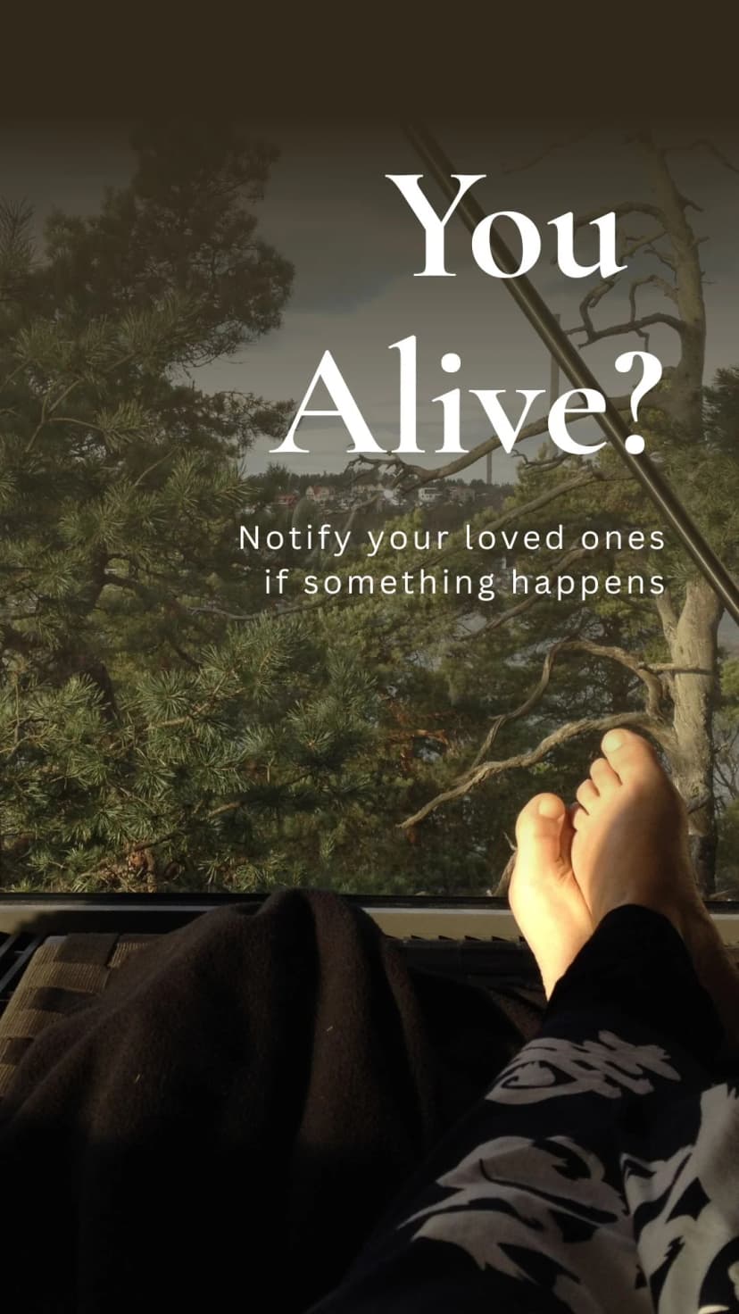
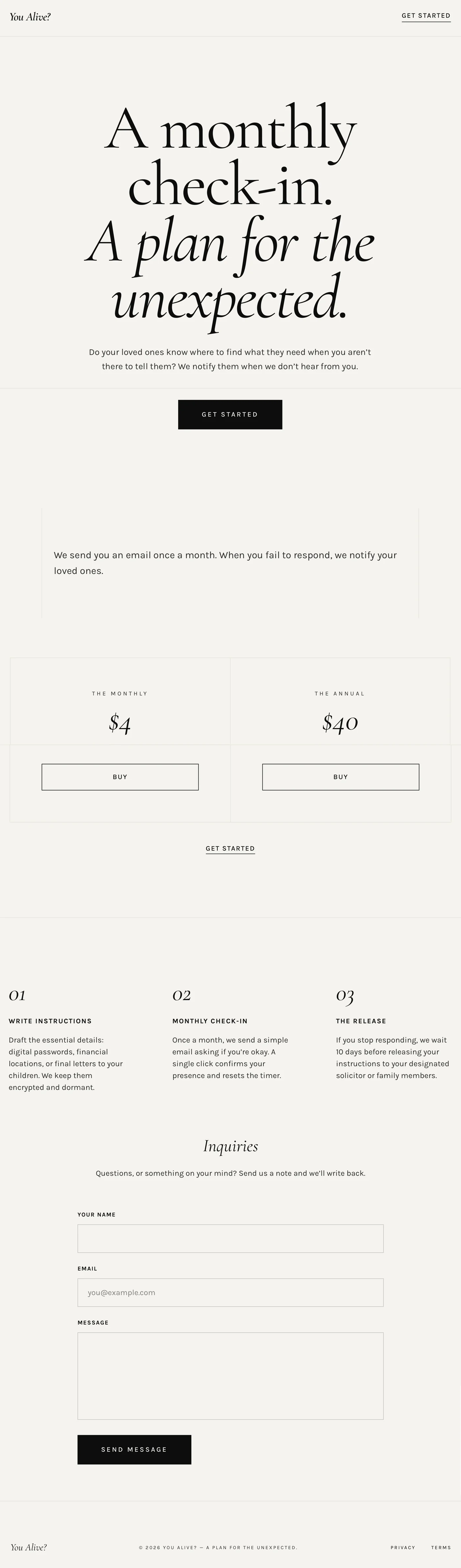
The ads were doing their job. CTR sat between 5.9% and 7.1% on the three best creatives, the ones we would match landing pages to (the campaign as a whole sat at 5%), and around 800 people came through. Then every creative sent them to the same very basic AI-built landing page, with none of the ads' branding, and 96% left within seconds. Nobody left an email on the waitlist. So the question was not "just make a nicer site" but "why does the site itself not convert". I listed five hypotheses, each with its own test:
- H1, wrong ad algorithm: the campaign was optimised for traffic, not conversions. Install the Meta Pixel and compare the two.
- H2, unclear copy: rewrite the whole page along sections that convert, and state the problem plainly.
- H3, value proposition not compelling enough: test two or three value propositions tied to the same problem.
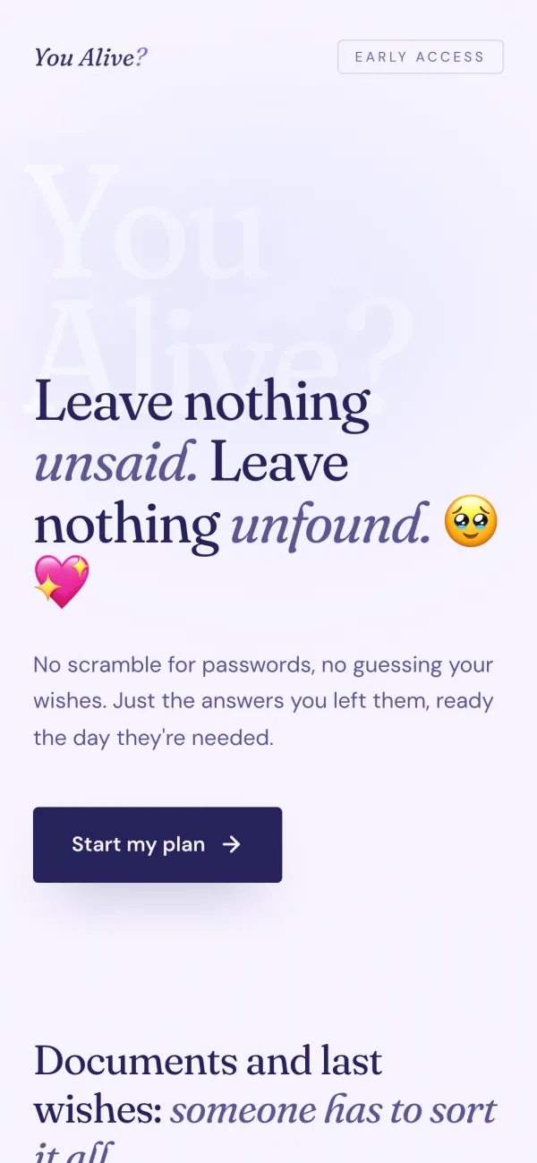
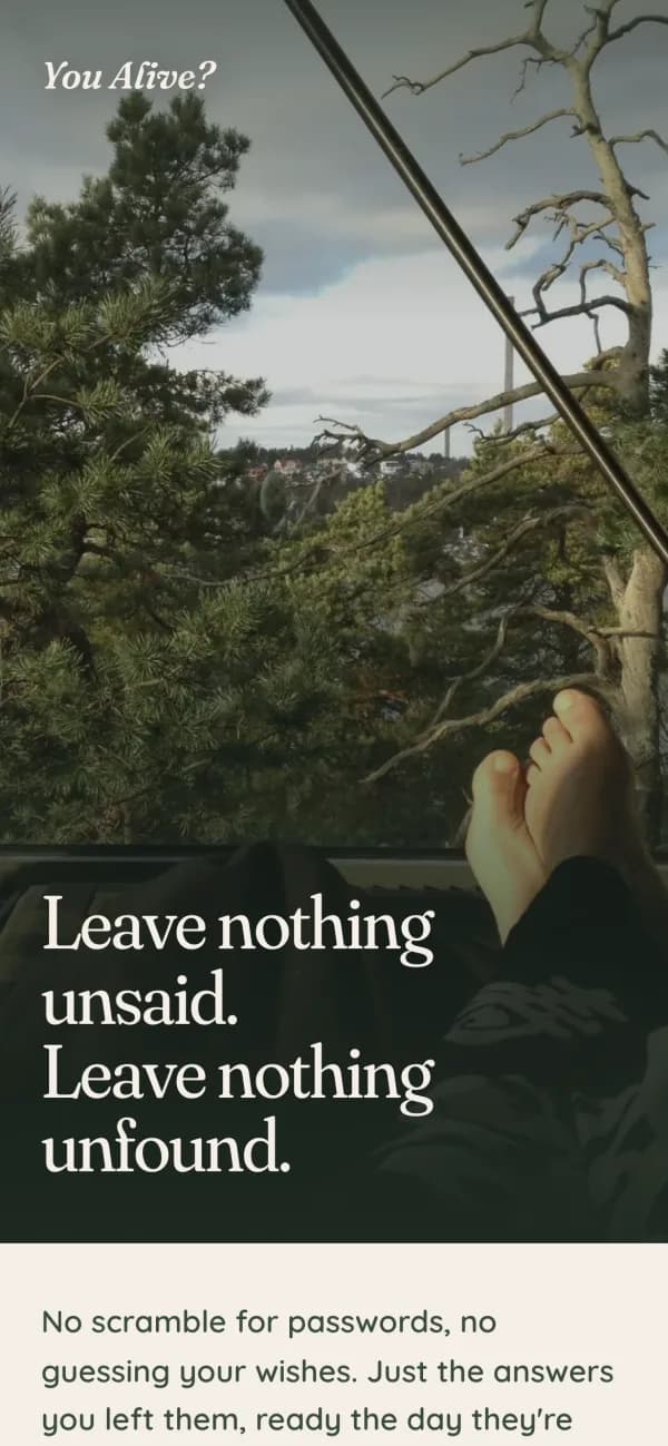
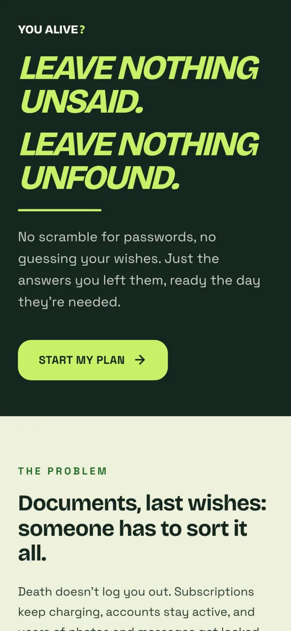
- H4, ad-to-page mismatch: a landing page that looks nothing like the ad that sent you breeds distrust.
- H5, weak visual design: improve the branding once the target is known.
We went with H1, H2, H4 and H5. I would have tested H3 first, one page and several value propositions, before several designs. The client wanted to validate her testing process, so H3 went to a second round.


836
Visitors
96%
Bounce rate
9 - 1.1%
Pricing page clicks
0
Emails on the waitlist
2. Clarified the founder's value proposition into six sections with a clear specific wording to optimize conversion
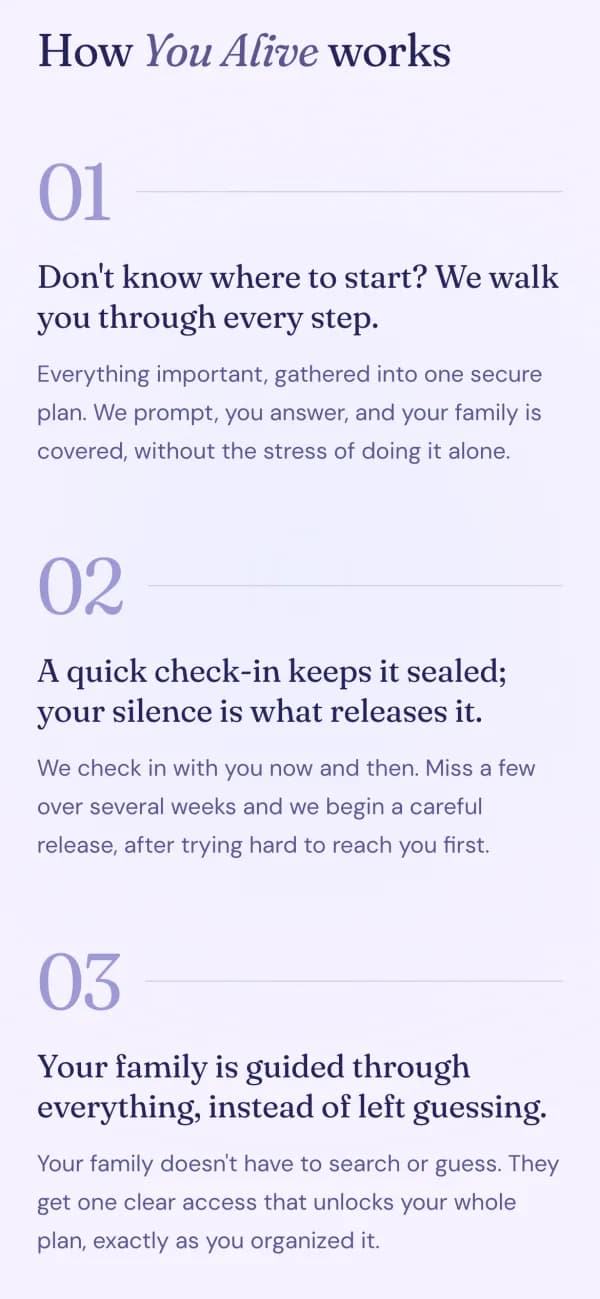
A fake door only works if a stranger gets the promise in five seconds, and that is a founder problem before it is a design problem. So before any layout I worked the message with her, section by section: promise, problem, how it works, price, proof, last push. Three options per line, drafted ahead of the call; on the call I explained the why of each section and challenged her choices; after it she reworked the final words alone. The hard question was the level of detail: enough that people want to sign up and pay, not so much that we promise a vault we will not build. That copy was frozen on all three variants. Change the design, never the words.
- If something happens to you, they'll still hear from you.
- Don't leave your loved ones guessing.
- Leave nothing unsaid. Leave nothing unfound.
- What your family will need to know, if you're not there to tell them.
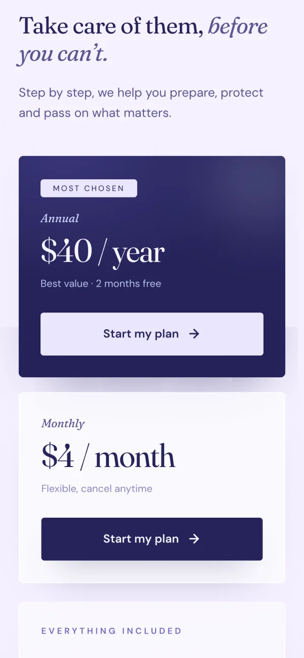
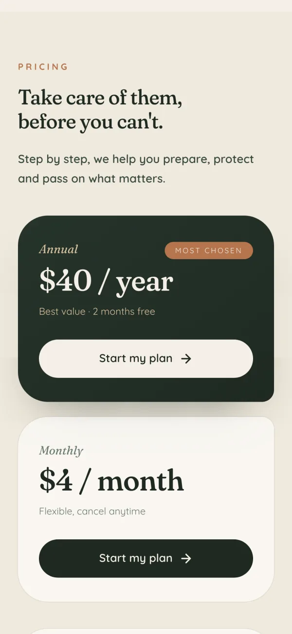
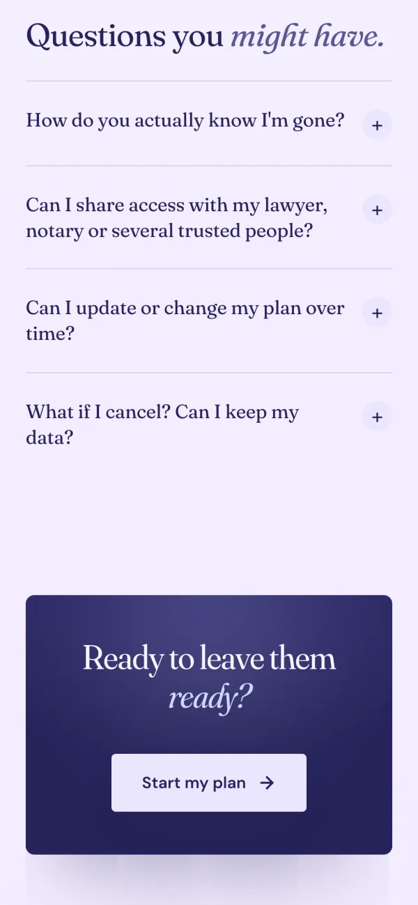
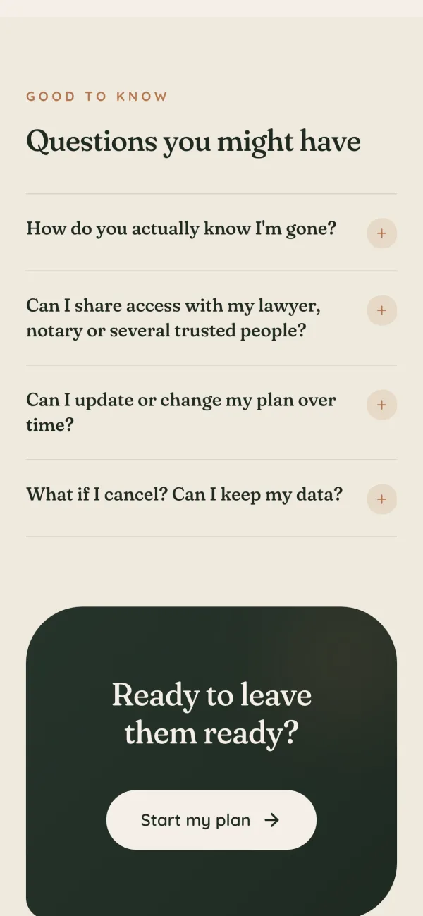
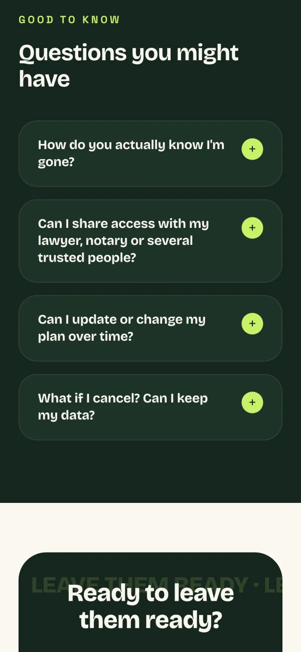
3. Generated 40+ landing pages with AI tools, then hand-refined 9 of them, three per creative ad, to present to the client
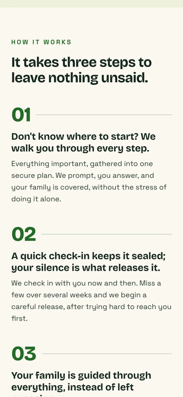
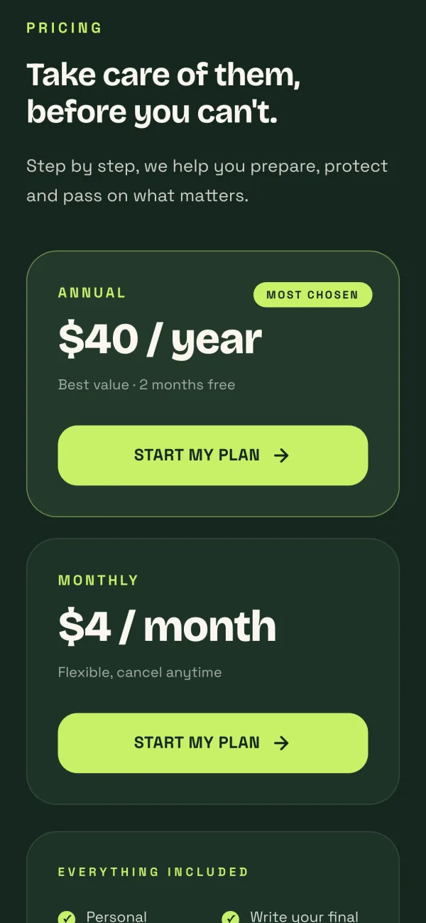
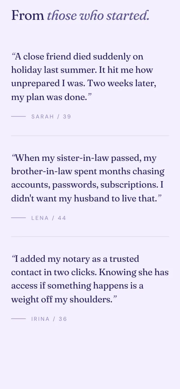
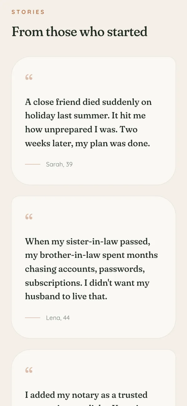
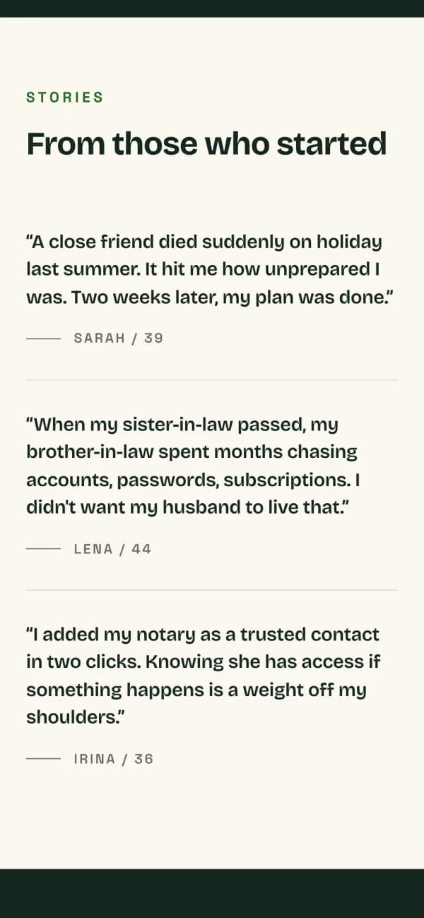
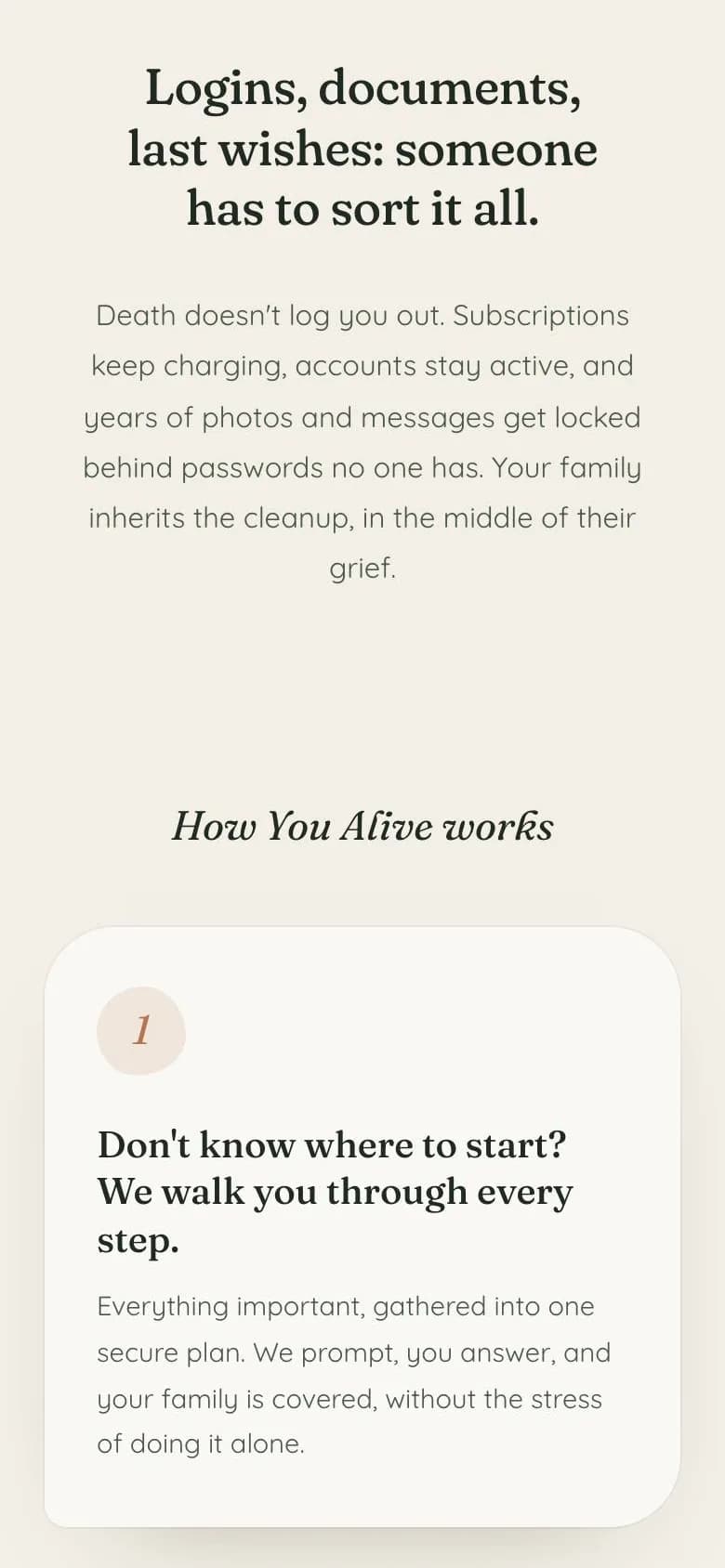
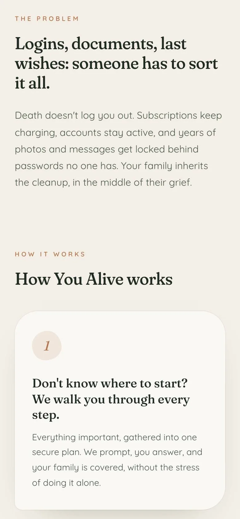
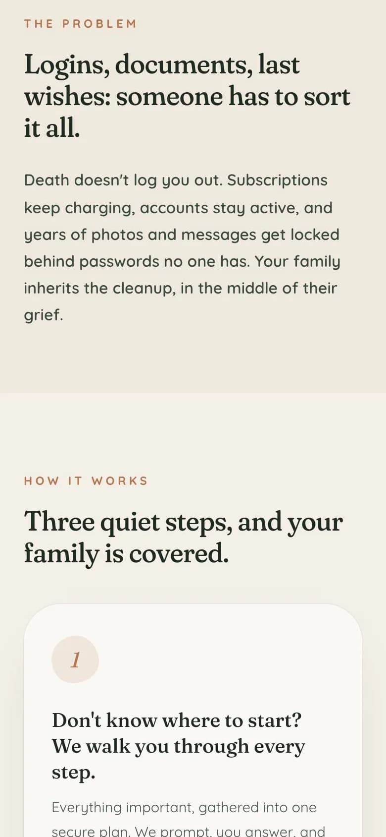
With the copy frozen, design was the only thing left to vary. One day generating 40+ pages with Google Stitch, frontend-design and taste-skill: fast idea generation, each page briefed from the palette and mood of one creative ad, every iteration landing in a gallery, for an overview and a first cut by the client.



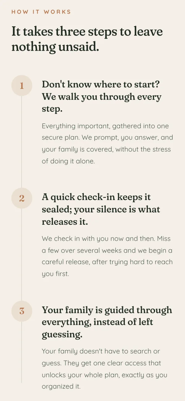
Then three days by hand on 9 of them: strip the AI slop look, fix hierarchy, spacing, rhythm and contrast, dose the animations, and assemble three candidates per creative. A round of feedback from her, one more pass. Since this was a fake-door test, none of it was engineered: no design system, no components, no code review. Vibe-coded on purpose, quick and dirty on a basic UI style guide, because the page only had to live long enough to answer one question.
1. Start from AI iterations
Cards used for everything, so nothing stands out
No visual hierarchy, no vertical rhythm
Motion too heavy, animations on every element
4. The new design moved every metric except the one that mattered, 1.3% emails: the value proposition did not convince
836 319
Visitors
96% 45%
Bounce rate
1.1% 29%
Clicked the fake door
0% 1.3%
Emails on the waitlist
The data came from two places: Meta for the ads, PostHog for everything after the click. The conversion algorithm costs more per impression, and it was worth it, clicks toward the fake door went from 1.1% to 29% of visitors (H1). Bounce fell from 96% to 45%, and that one also belongs to the new sections and copy (H2) and to pages that finally looked like the ad that sent you there (H4). We also saw big differences between variants, with variant C leading on every important metric and receiving all the emails.
But the most important metric did not move: 4 emails, 1.3% of visitors, where a fake-door test on cold paid traffic needs 5 to 10% to validate a promise. So we concluded that the value proposition did not resonate with the market the ads reached. The client preferred to kill the idea and moved on to a new one, which got a better email conversion.
| Round 1 | Round 2 | A | B | C | |
|---|---|---|---|---|---|
| Meta impressions | 20,410 | 2,146 | 265 | 1,110 | 771 |
| Link clicks | 1,023 | 346 | 32 | 191 | 123 |
| CTR | 5.0% | 16% | 12% | 17% | 16% |
| Visitors on the page | 836 | 319 | 52 | 119 | 148 |
| Bounce rate | 96% | 45% | 59% | 50% | 36% |
| Clicked the fake door | 1.1% | 29% | 6% | 29% | 38% |
| Emails | 0 | 4 | 0 | 0 | 4 |
5. Turned the repo and everything we learned into a system that guides non-designers and non-devs to a fully wired fake-door site
She tests product ideas for a living, so the useful deliverable was never one landing page. It was the ability to make the next one without me. I took the repo apart and kept only what was not You Alive: the tracking chain, the design contract, the gallery, the CRO research from the whole mission. Everything product-specific went out. What remained became a public GitHub template, meta-ads-website, with a setup skill that drives it.
The skill works in six phases and assumes the user is not technical. The user answers questions and pastes keys, the agent does the rest.
- 1
Bootstrap
installs, builds, runs the site locally, explains the plan in plain language.
- 2
Interview
asks about the product, the audience, the pain, the offer, the proof, the tone.
- 3
Copy
writes the answers into the site and iterates the wording with the user until it sounds like them.
- 4
Connections
walks the user through PostHog, the Meta Pixel and Conversions API, and the Notion base where the leads land.
- 5
Designs
generates several directions the user sorts in the gallery with a heart or a bin.
- 6
Ship
picks the finalists, deploys to Vercel, excludes the user's own traffic, and hands over to the ads.
What we delivered
The sites and the data the founder needed to decide whether to keep investigating the idea or drop it:
- 3 live design variants on shared copy, each matched to the ad sending its traffic.
- One measurement chain, Meta Pixel and Conversions API to PostHog and Notion, read in a dashboard split by variant.
- A system to run the next test without a designer: a GitHub template with a 6-phase setup skill. Copy, tracking and designs come out wired.


